Deeks Insurance
A redesign of the Deeks Insurance website, a BrokerLink company providing personal auto and home insurance to Canadians, with a focus on group rates for faith-based organizations, charities, and academic institutions.
Role
Lead UX/UI Designer, Research, Wireframing, Prototyping, Design System
Timeline
Summer 2025 - 9 Weeks
Tools
Figma


Context
Project Overview
At BrokerLink, I led the redesign of the Deeks Insurance website to improve usability and modernize its digital experience. The existing site lacked clear structure, making it difficult for users to navigate information and understand coverage options. With no existing design files, I established a scalable design system while redesigning the experience, focusing on clearer information architecture, simplified user flows, and a more intuitive experience.
The Problem
Insurance can be complex, but finding the right information shouldn't be. The existing website created friction through its information structure, content hierarchy, and inconsistent experience, making it harder for users to confidently navigate their insurance journey.

Research
Competitor Research
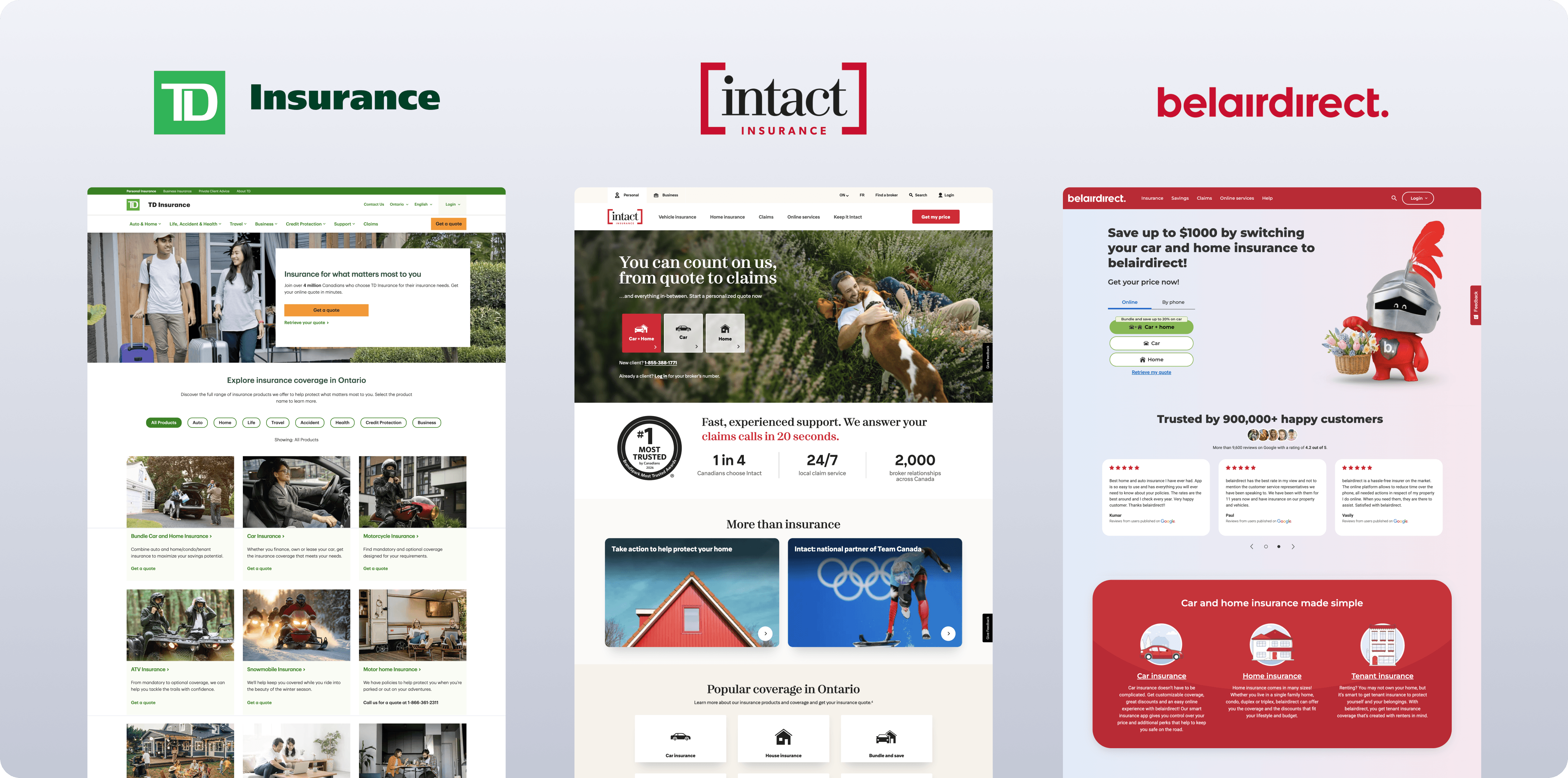
I conducted competitor research to analyze how other insurance provider websites structured their webpages and content to identify common patterns and how to organize insurance information clearly.

Information Architecture
Navigation
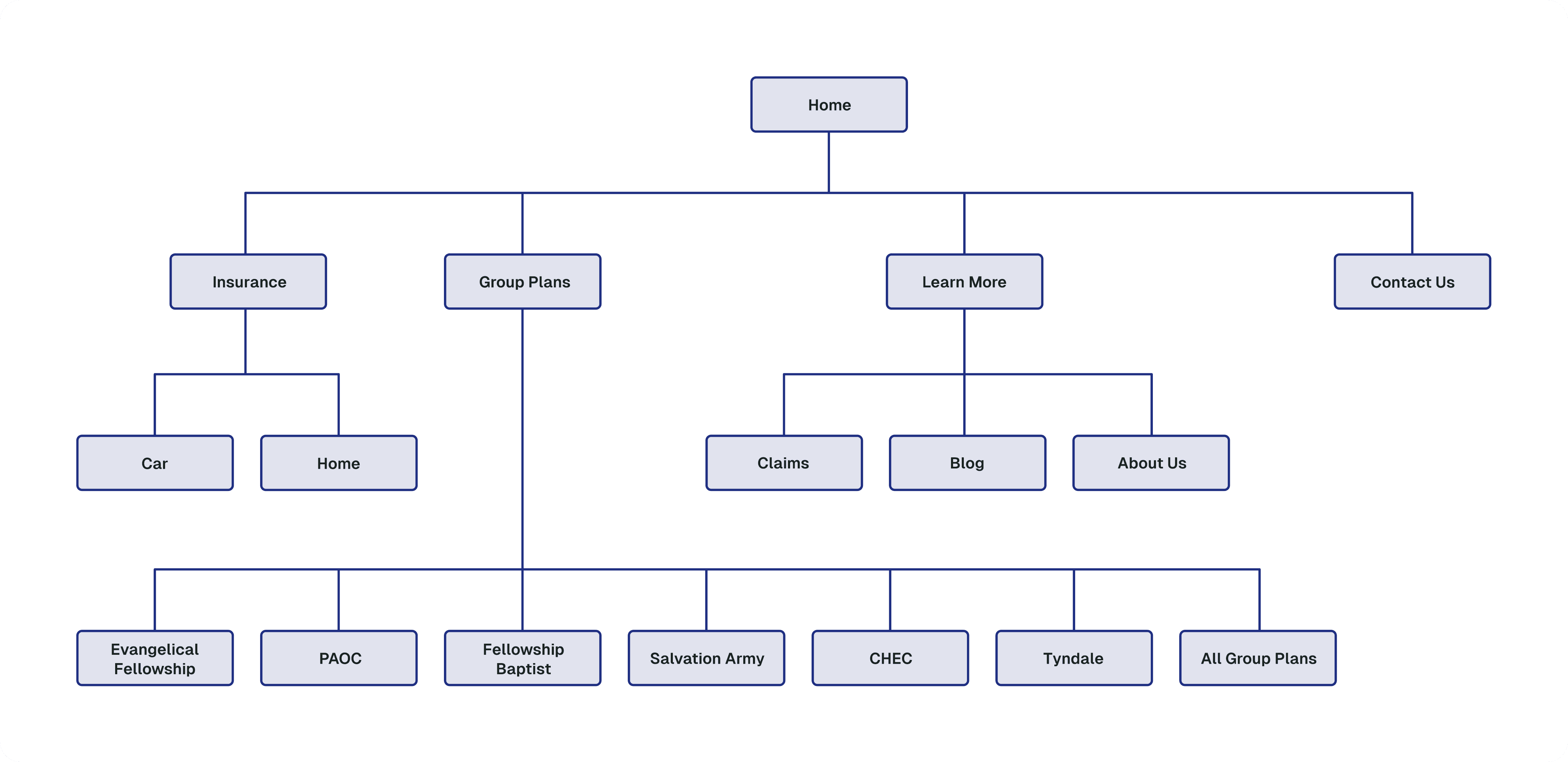
Before I began designing, I re-evaluated the navigational structure of the website by creating a system map. Originally there were 6 pages that you could navigate to from the navigation bar. To simplify this, I consolidated the claims, blog, and about us pages to a ‘Learn More’ dropdown.
Interface Redesign
Redesigned Webpages
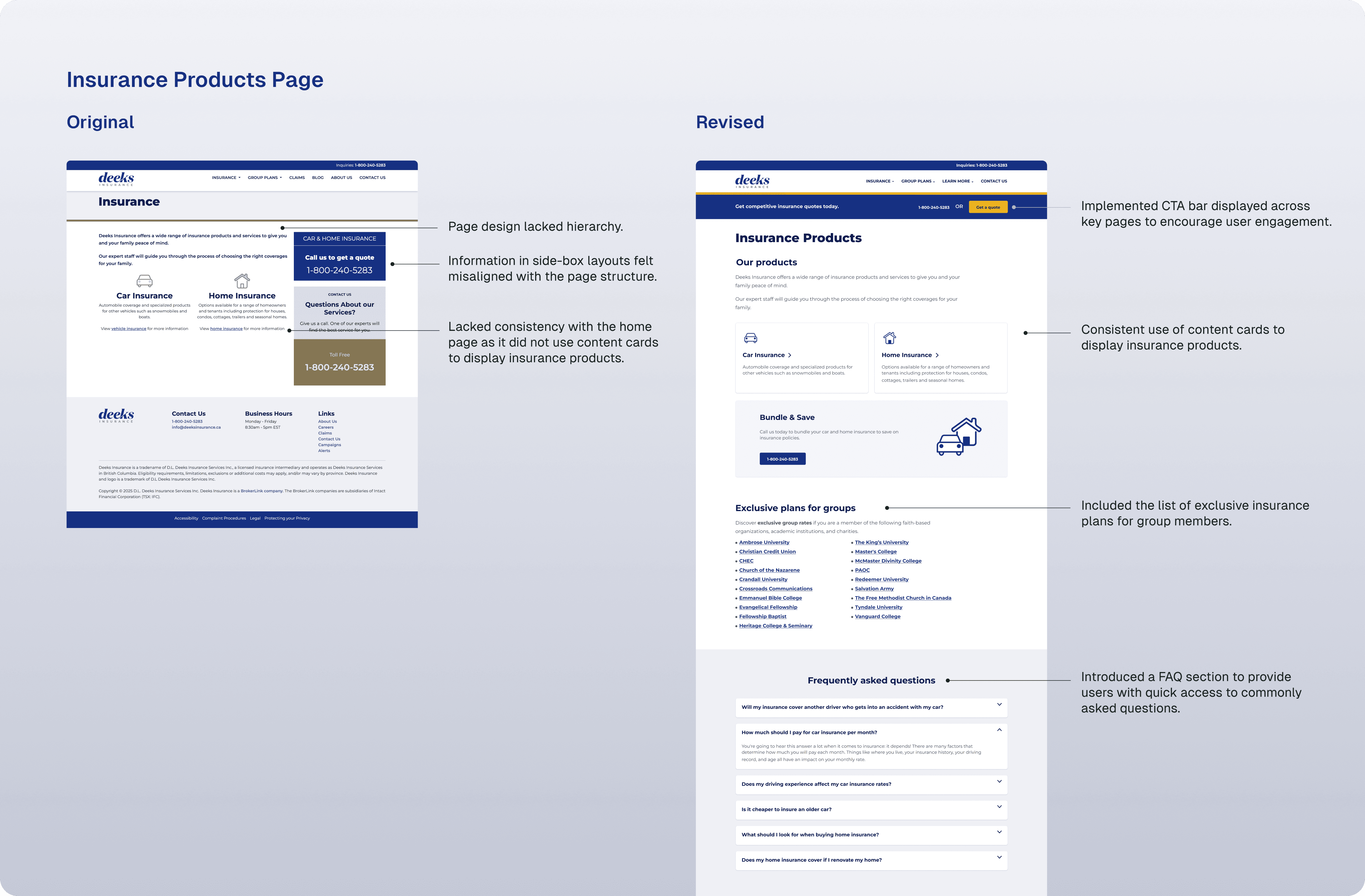
Below are selected webpages from the redesign, showcasing how I restructured content, refined information hierarchy, and created clearer, more intuitive layouts. I collaborated with product managers, developers, and designers to iterate on structure and content throughout the process.



Design System
Guidelines & Component Library
With no existing Figma design system, I built a scalable foundation for the redesign by defining colour and typography guidelines, creating reusable components and interaction states, and adapting components across desktop, tablet, and mobile.

Key Takeaways
Designing for Clarity
This project reinforced the importance of designing for clarity in high-stakes environments, where small improvements in structure and communication can significantly impact user confidence and decision-making.
Scalable Design Systems
Building the Deeks Insurance design system strengthened my ability to create reusable components, clear foundations, and structured documentation that support consistency and scalability as a product evolves.
Let’s Connect!
© 2026 Samantha Mirabella - Made with love
Resume